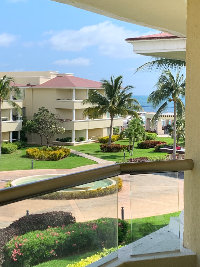
50
Artist Statement:
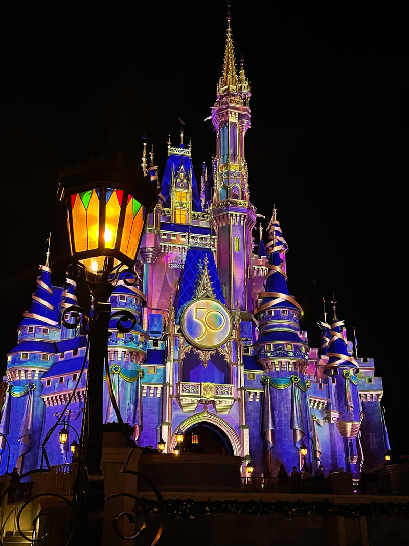
This photo was taken at Disney world's 50th anniversary in the magic kingdom. I love that amount of vibrant colors and how the lamp post adds a bit of depth to the castle to make it pop even more than it already does. i tried to focus on getting the whole castle in the frame while having just enough height to make it so that the photo didn't extend longer than it actually needed to be. But overall, this is one of my favorite photos and i love it each time I see it.
Stillness
Artist Statement:
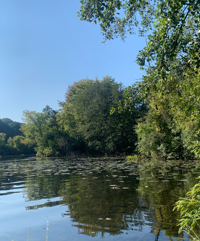
I always liked this photo, because of the amount of colors that seemed to be similar to each other. the amount of green in the trees, in the reflection, and the lily pads, made the whole sit right to me. The blue sky with no clouds also added a bit of ease to the photo, making the photo have a cozy at home feel to it. Overall, I love this photo and all the joy it brings me.
Peak
Artist Statement:
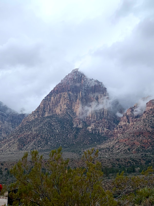
I love this photo because of the depth and symmetry it holds. the mountain in back that looks like it has a pointy peak because of the clouds and the surrounding mountain that make the middle mountain pop. I feel like this photo could use some editing since it somewhat looks blurry, but besides that i feel like this photo is very good and I am very proud because of it.
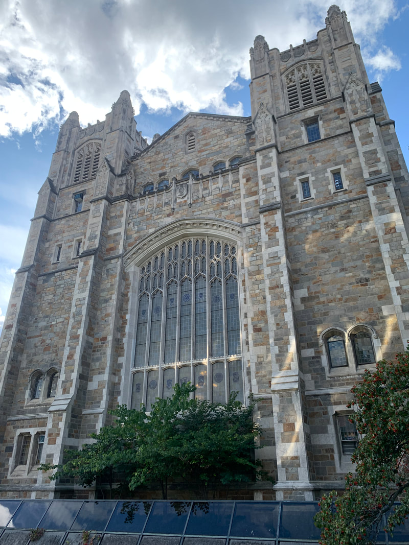
Knights Castle
Artist Statement:
this photo was taken outside of Michigan's university law school. i love the symmetry and sharp corners and interget detail it has. the medieval look to the building parried with a bright blue sky and bright clouds make the photo pop and not look dark and gloomy. But I still think of the building as a medieval castle, even though the mood of the photo doesn't convey that. the little greenery at the bottom of the photo and the angle of that the photo was taken adds that final touch that makes this photo so good. overall, I really like this photo and believe that it is one of my better photos i